World Champion 2013
By
.
.
.
Below article original link : http://qlikviewtrainingguide.blogspot.com/2015/10/winning-dashboard-creation-tips-from.html
Business intelligence (BI) software vendor QlikView recently ran a contest called the Open Data Challenge: here, BI users were to analyze data on populations, poverty, health, education, transportation and the environment, and create a dashboard that would inspire users to take action. And contestants could only use open data (meaning data that is publicly available for free download).
First-place winner of the contest is Alexandre Perrot: as a QlikView Solution Expert for Keyrus, he has a decade of experience developing business intelligence dashboard applications.
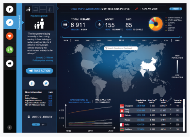
His dashboard “Do You Realize?” tells the story of how great the human impact is on our planet, and provides end users with resources for effecting positive change. Perrot completed the project in just three weeks: an amazing turnaround.

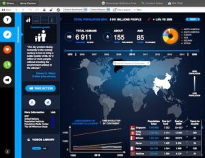
The “Environment” screen of Perrot’s dashboard, displaying information about population growth for selected areas of the world.
I caught up with Perrot to discover the dashboard creation tips that helped win him first place in this contest. Here are some of his best practices for creating an effective and actionable application:
Think About the Data Before the Dashboard
Before you even begin to build your dashboard, you must think carefully about the data and how it will be used, says Perrot. It’s absolutely imperative to use accurate, relevant and reliable data: if your numbers aren’t sound, the insight they provide is misleading, and the dashboard isn’t useful.
You also need to organize this data and present it in a way that makes sense. Perrot commonly uses star or snowflake schemas, and this is what he suggests others default to. For most datasets, these models provide the best infrastructure for organizing data and enabling the end user to view it in a variety of different ways.
Here is the snowflake schema Perrot used in the “Do You Realize?” application:
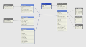
Here, you can see that the user is given different dimensions they can interact with depending on how they want to view data: they can choose to filter the results by “Year” and “Country.” The field “KEY” is most important, because it provides the link between all other data tables.
This means that whether the user is viewing all the data at once or only looking at a specific country or year, they’re always looking at the same information, just from a different angle. In this example, the star schema is most efficient. Here, instead of recalculating the information every time a user specifies a country or year, all the data is always readily available—it simply displays different information according to the user’s specifications.
Perrot estimates that 60 percent of the time he spent working on this project went towards brainstorming how the end user would need to interact with the dashboard application. This included ensuring that he had the perfect data model to reinforce expected user behavior and to present the right information quickly, clearly and accurately.
It’s also important to think about how this data will be used. Here are some of the questions Perrot suggests dashboard creators ask business users:
- Which Key Performance Metrics (KPIs) will be most important for the end user?
- What story are you trying to tell through your dashboard?
- Which data supports that story, and illustrates it most clearly for the end user?
- What are the common dimensions of analysis between my different data sources?
- Which data is the user going to click on and interact with?
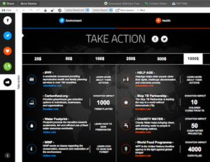
The “Take Action” screen, which provides users with links to charities they can donate to in order to make a positive impact.
Develop the Overview Screen First
When looking at the overview screen—the high-level screen that summarizes the dashboard’s most important information—the end user should instantly understand what is wrong with his business (or, in the case of the Challenge, what is wrong with the world).
Perrot recommends building this screen first; when creating “Do You Realize?,” he started with the “Overview” screen. Next, he builds additional screens that will help the user better understand the significance of a given KPI: here, the “Environment” and “Health” screens.
Finally, he builds out a screen that allows the user to compare different data points and build their own analysis. It’s important to work in this order, Perrot says, for a few reasons:
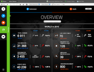
- The overview screen is essentially a high-level summary of the your most important KPIs. If this screen isn’t clear, it means that you don’t know what you want to explore and demonstrate with your dashboard, says Perrot.
- Since it presents all the most important information in one place, the overview screen is where the majority of your end user’s business questions will arise from. You have to imagine all the questions the end user might have after seeing the dashboard, and develop the other views to help him answer those potential questions.
- Once the overview is clear, Perrot says, the rest of your application and the story it tells will come naturally. Without having this first, you’re likely to develop overly complex, inconsistent screens—or worse, screens without relevance to the end user’s business needs.
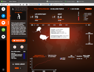
The Overview screen for “Do You Realize?” provides a snapshot of the most important KPIs for the world as a whole and how they have changed over time.
Create a Dashboard That’s Both Attractive and Informative
As with so many things in life, first impressions are crucial when it comes to your dashboard. A well-designed, attractive dashboard is more compelling to the end user—as long as it’s also functional. Your design choices can also inform your data, indicating important things to the reader that help them understand the greater message.
→ Use color to convey change. Change over time is a key component of almost any dashboard. According to Perrot, the best way to help the end user quickly visualize this is to use color coding. Assigning colors to trend lines or data points can tell you something about the data: for example, green means the measure is moving in a positive direction; red means it’s not.
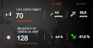
→ Use a four-column table to express change. Another effective way to represent change over time, Perrot says, is to use a table with a time breakdown (usually by month) and at least four columns, which contain: the actual value; the comparative value; the percentage or value of change; and a color indicator (red or green).
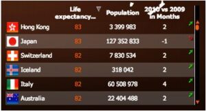
→ Choose function over form. If you have to choose between form and function, lean towards function. A dashboard that’s pretty but that doesn’t work right isn’t worth much to the end user. For example, Perrot’s dashboard includes both clickable countries and a search field to make sure users are able to quickly drill down to country-level specificity.
Make Your App Easy Enough for Anyone to Understand
Make sure that the analysis your dashboard conveys can be easily understood by all end users. Without having any prior knowledge of the subject, the user needs to be able to look at your app and instantly understand what message the data is trying to convey and what it means to them personally.
- Since dashboards help business users make decisions quicker and more easily, you need to create applications that lead the uninitiated user to the same conclusions you came to. Perrot says his ultimate test is to show his completed dashboards to his wife: “If she doesn’t understand everything, it means something is wrong and I need to restart.”
- In this Challenge, Perrot’s primary goal was to keep it simple. If you try to include too much information in your app or clutter it with graphs and tables, he says, the end user will get lost. Here, it was also important to clearly and directly tie the KPI data to specific actions the user can take to make a difference.
- When building dashboards, Perrot recommends getting straight to the point. Display the most interesting data the most prominently—and, perhaps most importantly, use visual elements that help users understand where the numbers come from and how they evolve over time.
Perrot’s dashboard is simple and to-the-point: important information is displayed prominently, charts and graphs convey change over time and pop-ups provide a summary of relevant data.
While these are good general guidelines, don’t be afraid to break your own rules: in the end, always let the data dictate your dashboard. For example, when developing QlikView applications, Perrot usually puts the dimensional filters of the left side of the screen.
For the Challenge, however, he wanted to use the left side to navigate the different sub-menus as well as to access outside sources like video. There’s always room for innovation.
Following these best practices helped Perrot win first place in the QlikView Open Data Challenge—and you, too, can use them to create more effective and actionable dashboards that inspire your users to take action.
.
.
.


